
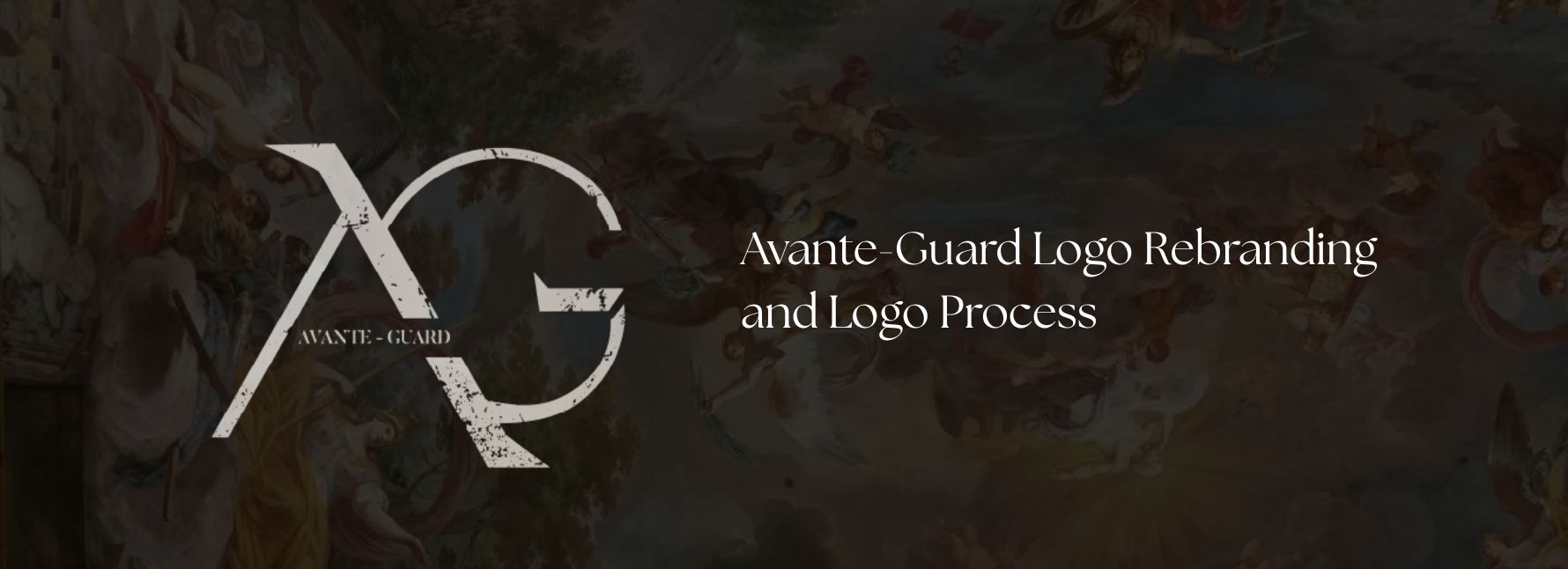
Avante-Guard: Logo Rebranding
Avante-Guard is a production company and the Philippines’ premier poster provider. The brand also promotes film and cinema experiences for cinephiles, and ventures into music and fine arts.
Prior to our collaboration, the brand already had an existing identity. My task was to work around and elevate their logo, giving it a more professional and premium face while respecting their original foundation.
The problem and the goal
Avante-Guard needed a logo that would accurately reflect the business: premier, professional, and creative. I aimed to evolve their existing logo into something more elegant, geometric, and sharp without losing the brand’s original character.
Role and responsibility
- Designing a fresh, unique logo
- Staying aligned with their current brand essence
- Honoring the existing logo while improving it
- Creating a logo system that fits various brand extensions
In short, I was tasked to reshape the face of the business.
Client Prompt with existing materials
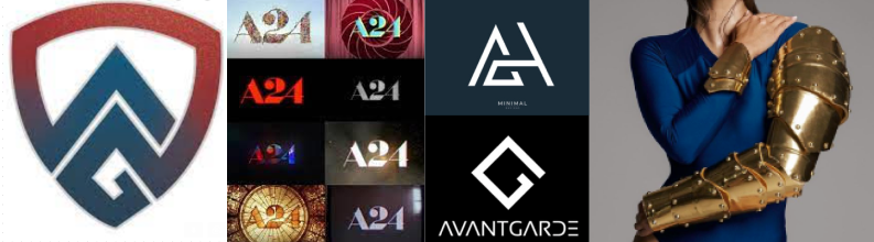
The client provided the existing logo and described the new direction:
“We want something that looks premiere, artistic, independent, luxurious, geometric, and sharp.”
Moodboard presented by client:
Logo Iteration and Approvals
With the prompt and visual references in hand, I began sketching logo options on my tablet and moved to Adobe Illustrator for refinement.
The process and breakdown of the iteration of logo and feedback from the client

I submitted a first pitch with 3 different logo designs.

The client chose one to iterate on — these tweaks are called versions.

If they wanted more options beyond the initial 3, I created another round of 3 new logos.

Once a direction was locked in, I kept iterating until we arrived at the final logo.
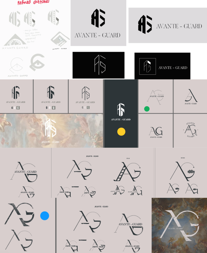
- 🟡 The client initially leaned toward the first logo from Round 1 (yellow highlight).
- After 3 versions, they felt it wasn't a long-term fit.
- 🟢 We proceeded to Round 2 — the client was drawn to the second logo (green highlight).
- 🔵 After more refinements, we landed on the third version of that design (blue highlight) this became the final logo.
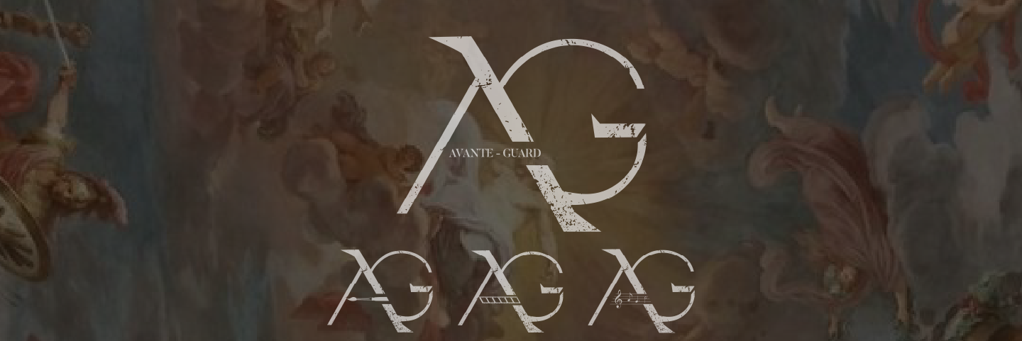
Final Design and New Set of Logomarks
The final design consists of five variations of the main logo: The main logo, Logotype, for Cinema and Films, for Music, and for Fine Arts. The following is presented below:
Logo Application
The logos are now used across brand materials. Each content category uses a matching logo variation (e.g., AG + Film for cinema posts).
Results and Impact
The rebranding project wrapped in September 2022.
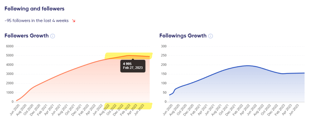
According to TrendHero.io, the brand’s Instagram had:
- 4,200 followers in August 2022
- 4,995 followers by February 27, 2023
That’s a growth of 18.9% (an increase of 795 followers in ~6 months).
While social media management wasn’t part of my role, I believe strong branding contributed to the brand’s visual credibility and success.